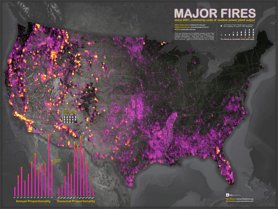
A new map using NASA data reveals an increase in the frequency and severity of fires in the United States since 2001.
The map, created by John Nelson of IDV Solutions, shows the locations and intensity of major fires in the contiguous 48 United States from 2001 through early July 2012.
Fire intensity is scaled by “units of the typical American nuclear power plant’s summertime capacity” with yellow reflecting the most intense conflagrations. The map is based on MODIS fire hotspot data.
The most intense fires usually occur in forested or peatland areas, according to Jessica McCarty of the Michigan Tech Research Institute. Fires generally peak in August.
2011 had the largest number of hotspots during the period, but 2012 data only runs through July 9th.
Related articles


