The map does not distinguish between natural forests and plantations, but the underlying database will support the development of additional layers, which can be used to create masks for oil palm and timber plantations, enabling users to distinguish between deforestation, replanting of plantations, and conversion of forests to plantations.
The forest map released last week by a team of remote-sensing experts has produced some confusion — and criticism — over exactly what it shows.
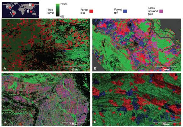
The map provides a global assessment of forest cover defined “strictly biophysically”, according to Peter Potapov, one of the authors of the paper that describes the dataset underlying the map. It counts areas with trees of 5 meters tall or higher as “forests”, meaning that natural forests are treated equally as plantations, including most timber and oil palm plantations.
Therefore “forest loss”, as measured by the tool, doesn’t not necessarily reflect deforestation. In some cases “forest loss” may represent replanting of existing plantations, especially in countries like Indonesia and Malaysia where acacia, eucalyptus, and oil palm plantations are replanted on regular cycles. For timber plantations, this cycle might be every 6-8 years. For oil palm plantations, the cycle is typically 20-30 years, depending on the quality of the stock, yields, and palm oil prices.


View of forest loss in Indonesia, 2000-2012, with a zoomed in look at Central Kalimantan, where oil palm plantations are being rapidly developed.
While the inclusion of plantations have led some to declare the map meaningless or an instrument of propaganda, the utility of the tool goes well beyond mapping forest cover. For one, the dataset is the first to offer global coverage on a consistent and timely basis. Unlike the Food and Agriculture Organization’s reports that come every five years and rely on notorious spotty self-reporting from forestry departments, the map will be updated on an annual basis using standardized methodology. Furthermore, the data, once published next year, will be freely accessible via the web and presented in an interactive format.
More importantly, the availability of the data will enable other parties to develop “layers” that sit atop the forest map. For example, concession data will allow researchers to mask plantation areas, disaggregating oil palm and timber estates from natural forests and enabling accurate summation of deforestation rates on an annual basis. Similarly, spatial data on indigenous reserves and protected areas will help policymakers understand the effectiveness of various conservation approaches. Data on roads, oil and gas exploration blocks, fire history, logging concessions, and mining operations can all be used to create mash-ups with the forest map, providing insight on drivers of deforestation.
So in other words, the new map serves as a strong foundation for many applications to come. These applications will help humanity better understand and assess what it is doing to the planet’s forests.

Regional subsets of 2000 tree cover and 2000 to 2012 forest loss and gain. (A) Paraguay, centered at 21.9°S, 59.8°W; (B) Indonesia, centered at 0.4°S, 101.5°E; (C) the United States, centered at 33.8°N, 93.3°W; and (D) Russia, centered at 62.1°N, 123.4°E. Image and caption courtesy of Science
CITATION: Matt Hansen et al. High-Resolution Global Maps of 21st-Century Forest Cover Change. SCIENCE VOL 342 15 NOVEMBER 2013