New images show just how much US temperatures in July and January have changed recently as the nation feels the impact of global climate change. Dubbed the ‘new normals’ of US climate, the maps focus on July maximums – typically the hottest month of the year – and January minimums – typically the coldest month. While both July highs and January lows warmed recently, January lows saw the biggest jump.
By contrasting temperatures from 1971-2000 and 1981-2010, the maps show significant rises in temperatures in many parts of the country. While July maximums saw some cooling in the Midwest (up to 1.5 degree Fahrenheit), the temperatures rose elsewhere, including up to 3 degrees Fahrenheit in parts of the West and Pacific Northwest.
January minimums rose even more starkly. Except for Florida and parts of the Southeast, January minimums rose everywhere else, especially in the Midwest and Rocky Mountains, where between 1971-2000 and 1981-2010 minimums jumped up to 4 degrees Fahrenheit.
All fifty states saw average temperatures rise between 1971-2000 and 1981-2010.
According to decades of research from thousands of scientists, the world is warming because of emissions of greenhouse gases from human actions, such as burning fossil fuels and destroying forests.
During the 20th Century, the global average temperature rose about 1.33 degrees Fahrenheit (0.74 degrees Celsius). Expected impacts from climate change include more frequent and worsening extreme weather events, greater precipitation events (both rain and snow), worsening droughts for parts of the world, global sea level rise due to polar melting, large-scale species extinctions, ocean acidification, a rise in massive fires, changes in the range of diseases, and many others. Water supplies, food production, societal health, the global economy, and international stability are all expected to be threatened by climate change.
Future warming depends on how rapidly global society brings down current greenhouse gas emissions.
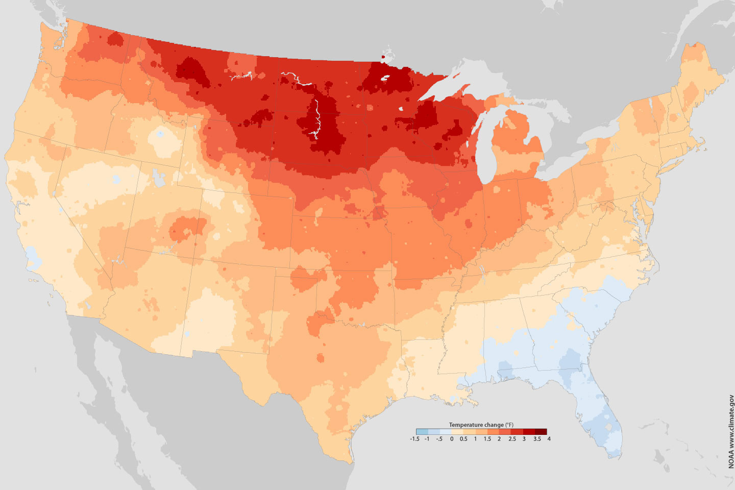
January minimum temperature comparison from two 30 year measurements: 1971-2000 and 1981-2010. Map courtesy of NASA. Click to enlarge.

July maximum temperature comparison from two 30 year measurements: 1971-2000 and 1981-2010. Map courtesy of NASA. Click to enlarge.
Related articles
Climate change to push over 10 percent of the world’s species to extinction by 2100
(07/11/2011) Scientists have predicted for decades that climate change could have a grave impact on life on Earth, which is already facing numerous threats from habitat loss, over-exploitation, pollution, invasive species, and other impacts. However, empirical proof of extinctions–and even endangerment–due to climate change have been difficult to come by. A new study in the Proceeding of the National Academy of Science has found that by the time today’s infants are 90 years old (i.e. the year 2100) climate change could have pushed over 11 percent of the world’s species to extinction.
Hot map hard to ignore: interactive map points out local climate impacts
(06/29/2011) A global interactive map has been developed by the Union of Concerned Scientists (UCS) to highlight climate impacts already occurring worldwide. From glacier melt risking water supplies in Bolivia to coral bleaching off the coast of Florida, the Climate Hot Map employs the best in climate science to bring home the impacts of global warming.
Current carbon releases faster than at any time on record
(06/13/2011) The Paleocene-Eocene Thermal Maximum (PETM), a period of global warming that occurred nearly 56 million years ago due to massive releases of greenhouse gases, is frequently referenced as an analogue for projected climate change. However, recent findings suggest the current rate of carbon release is almost 10 times as rapid as at the peak of the PETM—and that biological systems may be significantly less able to adapt.