- Global Forest Watch’s on-the-fly analysis tool calculates forest change within a specific area and time frame without experience using GIS software.
- The user can customize the area and time period of the analysis by drawing or uploading polygon shapes.
- These basic analysis tools can help users address a variety of forest spatial data questions.
Let’s pretend you manage a forested area, as a forestry official, park manager, or timber company executive, and you want to ensure that logging teams remove trees according to their extraction plan, without overharvesting or clearing outside their allotted area each year. You might also want to examine or verify the progress of a tree planting program started several years ago.
Or, perhaps, as the new manager of a state park or forestry concession, you might want to examine the development that has sprung up on either side of a road built in your areas 5-10 years ago– have people spread out from the road and cut down forest illegally to plant crops or build houses? Or has the forest cleared by the road construction grown back over time?
How can you examine changes in the forest cover in your area of interest, without sending out patrols or flying a plane (or drone) over the whole area?

You can visualize and quantify these changes if you have access to up-to-date information about forest cover and the capacity to analyze spatial data through remotely sensed imagery, Geographic Information Systems (GIS), Google Earth, and other databases and statistical programs. But frequently, learning curves and limited resources limit the use of these powerful tools to a subset of researchers, forest managers, private industry, and others with sufficient resources for data analysis.
A previous Wildtech post introduced some of the basics of using Global Forest Watch, a free online platform that provides open access to up-to-date satellite imagery, other spatial data sets, and tools to present and download data on where forests are expanding and disappearing. Here we continue the “GFW Basics” series with this report on some of the on-the-fly analyses that you can carry out directly in GFW without special GIS tools or satellite imagery.
GFW does not replace a GIS program, and its analyses revolve around forest change in a given area during a given time period. Still, the tool is free, so anyone with a computer and internet access can view and analyze the site’s information on forest cover, loss and gain at a variety of scales using GFW analysis tools.
What analyses are possible?
You might, for instance, want to examine forest status properties of a particular area or group of areas. You can query the status of and change in tree cover for the whole world’s forests, or those of a country, region, protected area, or logging concession that you select from the menu options.
To conduct a basic analysis, you’d start by visiting the GFW website homepage and then clicking on the Explore button, at the top of the page, and the button for the Interactive Map, which allows you to view all forest change and related data layers.

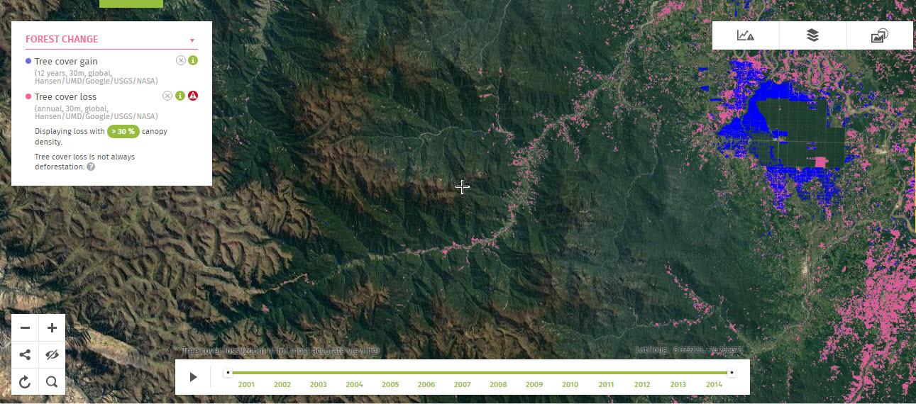
On the map page, you can view a default dataset that shows the world’s forests and areas of forest loss (in pink) and gain (in blue) at 30m x 30m resolution. At the top of the map** is a series of tabs, as well as several on-screen menus with options to add areas within which you can quantify forest change.
| **Screen size matters: If you do not see the tabs (Forest Change, Land Cover, Land Use, etc) at the top of the map, the Forest Change menu at the left, and the Timeline slider at the bottom, check the size of your GFW window. If you open the map in a small window, such as on a laptop or mobile device, the platform displays differently because it’s mobile-optimized. The menus and map display (e.g. zoom) options are hidden within icons at the bottom of the Interactive Map, rather than being visible on or at the top, so they are harder to find.To use the full-size display, try maximizing the GFW window to provide sufficient space for the menu display; otherwise, you can find these options via the Layers, Timeline, and Analyze & Subscribe icons at the bottom of the map. |
A quick basic analysis
Assuming from now on that you see the standard GFW menus on a large enough screen, you can now:
1. Turn on one of the layers in GFW, such as protected areas or logging concessions, by selecting it from one of the Land Use or Conservation tabs at the top of the map. Consult our previous post for an overview of how to view these menus.
Be sure the relevant Forest Change layer (e.g. tree cover loss) is turned on (it should be by default).
To zoom in to a smaller area and see your target shape in better detail, double-click on the map or click the Zoom In icon on the left of the map.
2. Click on a shape in your layer of interest to see its name and basic information. Click Analyze to view the area of the shape and the total amount of forest lost and gained for the map’s time period (the default tree cover loss dataset shows 2000-2014, though an alert system database, to be covered in a future post, can be much more recent). You can shorten the time period using the slider at the bottom of the map.
The results look something like this:

You can click other shapes in the same layer, one by one, to analyze their forest change. You’ll need to discard the previous analysis first, using the Discard Analysis button, before selecting another shape.
The GFW site has detailed instructions for using the interactive map and a related tutorial highlights how to navigate the map and load, view, and analyze various categories of data, but here we will look at the right-hand menu, to Analyze & Subscribe to a shape. This menu also has tabs for changing the Base Layer or adding some High-resolution imagery to your map, which we will ignore for now.

3. To analyze forest change for a country, click the Analyze & Subscribe tab in the right-hand menu. Select Country or Region, and then select the country, plus an internal jurisdiction if you want one. You’ll first need to discard any current analysis (GFW will prompt you up top) before starting one in a different data layer. This will work as your previous analysis did.
At any point, you can click on the Analyze & Subscribe tab to shrink this right-hand side menu or click one of the lower-left-hand menu items to hide the screen windows.
Customization
From the Analyze & Subscribe option, you can also choose to examine tree cover trends for one or more of your own polygon shapes (not points or lines) that you can draw or upload.
Sarah Mann, former GFW Community Innovation Coordinator, explained to WildTech that customization is one of GFW’s users’ favorite features. “They light up when they understand that they can draw any [polygon] shape they want anywhere on the map and conduct the desired analysis for that area.”
4. At this point, you can add your polygon area of interest – say, an animal movement corridor, or a provincial or state park not included the embedded World Database on Protected Areas – to the GFW platform in either of two ways:
(a) You can just draw the shape on the map, by selecting Draw or Upload Shape option and then choose to Start Drawing. You can then click to create the limits of your shape – to draw a precise or irregular boundary, you’ll want to do this when zoomed in to a fairly fine scale. And take your time clicking – the tool completes the polygon when it registers a double-click. However, once your shape is complete on the map, you can drag the points of the shape to make any adjustments.
Once you’ve completed a figure, click the Analyze tool button to see the selected area’s spatial extent and amounts of forest loss it has experienced during the time period in the timeline slider bar at the bottom of the map. Gain is currently a single value showing total gain from 2001 to 2012.

(b) You can upload a polygon spatial data layer in one of nearly 20 formats, including SHP (ArcGIS) and KML (Google Earth), by selecting the file’s icon on your computer and dragging it onto the interactive map’s Analysis box.
The platform has several restrictions on how files are uploaded that make this option less intuitive for inexperienced users. For example, to upload an ESRI/ArcGIS Shapefile (*.shp), you must first zip up all the associated files (see list of permitted file extensions below) before loading them into GFW, and there must be a projection file (*.prj) among these. You can add this file type in a GIS, so users without GIS experience or access should ensure that any zipped-up shapefiles files they receive include the *.prj file.
Moreover, any files larger than 1MB may not work properly, so you may need to split any files with global-scale data into separate regional data files before uploading. You’d need a GIS to do this as well. You can read all of the restrictions by clicking on the “I” information icon in the “Upload a Shapefile” box.
| To upload a custom data set into GFW: Drop a file on the designated area to analyze it or subscribe to it. The recommended maximum file size is 1MB. Anything larger than that may not work properly.
GFW supports these file formats (only polygon data is supported, not point and line data):
|
Once you’ve uploaded a file, the analysis results will appear automatically in the Analyze window, showing the selected area’s forest loss, and forest gain.
The Subscribe button that pops up allows you to register and sign up for updates on forest change in this area (more on this in a future post), and the Share tab below lets you electronically copy or share online a link to this map view and analysis results.
In the data layers menu on the left, you can click the green canopy density button to change the threshold tree cover density: this allows you to adjust your analyses for different vegetation types by shifting the pixel-level tree canopy density that you define to be forest.
The default density percentage is 30% tree cover, meaning pixels that change from having ≥30% tree cover to less than that will be counted as having lost forest. Analyzing change in tropical rainforest would suggest using a percentage of 75% or higher tree cover, while a savannah-woodland might be better analyzed using a lower tree cover percentage. You can try several different canopy densities to estimate “forest” and “forest loss” under different assumptions of tree cover. Some knowledge of the general vegetation class of your target area will help you here.
You can change the threshold tree cover density as you go in the list of layers displayed in the box at the left of the map.
Customizing the area and time period of your analysis
To help determine when forest was cleared or shift the time period of the analysis, you can move the time slider at the bottom of the interactive map. You can ask GFW to quantify tree cover change over the desired time period for the area within your shape(s) of interest or compare this change to the change in a similar unit of interest.

So, for instance, you might want to:
- Compare forest loss trends in different countries or provinces over a particular 1-year or 5-year period;
- Determine whether the loss of tree cover within forestry concessions is greater than expected, suggesting illegal logging;
- Monitor regrowth in tree plantations with different reforestation treatments (coming soon);
- Measure deforestation around commodities plantations, such as those for soy and palm oil, to help verify claims of “sustainable” supply chains;
- Discover trends in tree cover status along the long-distance migration routes of your study animals;
- Keep watch over the hiking trails in your favorite provincial park if you suspect forest is being cleared.
How to determine what is causing forest loss
Information on tree cover loss alone will not explain what is causing the deforestation, and GFW is limited by the 30 m x 30 m resolution of the Landsat imagery on which it is based.
While ground-truthing an area will provide the most reliable information on the cause of deforestation, GFW offers the option to overlay higher-resolution satellite imagery with your forest change and shape(s) of interest. The presence of a new road or other construction near areas of forest loss in these 1–3 years old, 15-meter and higher resolution images helps to explain the changes.
Getting help
See Wildtech’s previous post on how to view, download, and share data, or check out this GFW how-to video and tutorials for using the Open Data Portal, where you can search for specific data sets by keyword, category, or country.
GFW users can visit the site’s “How-To” page for other tutorials, videos and instructions on how to use the various tools. Training modules and Frequently Asked Questions cover in greater detail the options mentioned here and other topics. Additionally, the GFW team welcomes feedback.
Disclaimer: The GFW partnership is convened by the World Resources Institute, a partner of wildtech.mongabay.com, though it does not influence the site’s content.